Virtualizer
A virtualizer component that allows you to efficiently render large lists and tabular data.
Introduction
Efficiently rendering large lists and tabular data is a common challenge in UI development. By leveraging virtualization, we can significantly enhance performance.
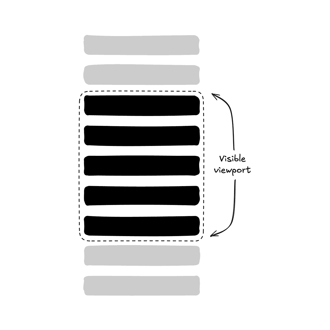

Rendering only visible rows of content in a dynamic list instead of the entire list using virtualization.
After exploring various libraries, I found virtua to be one of the most intuitive and effective choices. Its straightforward API allows seamless integration with other tools like @dnd-kit and Radix UI, making it easy to virtualize different components effectively.
This documentation serves as a guide to help you understand how to use the <Virtualized /> component. Feel free to create your own abstraction of the virtualized components, e.g. <VirtualizedScrollArea />, <VirtualizedSelect />, etc.
Important: Use virtualization judiciously. It's best suited for scenarios involving large lists or tables, rather than squeezing out every bit of "performance optimizations".
Installation
pnpm dlx cross-env REGISTRY_URL=https://ui-x.junwen-k.dev/r pnpm dlx shadcn@latest add virtualized
Examples
Default
Horizontal
Grid
Table
| Invoice | Status | Method | Amount |
|---|---|---|---|
| Total | $504,162.00 | ||
Note: Until virtua improves its support for table virtualization, you will need to manually set the cell width because of the current use of absolute positioning.
Combobox
Select
Scroll Area
Sortable
Combobox
To virtualize a <Combobox /> component, you'll need to use <Virtualized /> component.
Setup scollRef
Attach the scrollRef to the <ComboboxContent /> with <Virtualized />, as it serves as the scrollable container:
export function VirtualizedComboboxDemo() {
  return (
    <Combobox>
      {/* ... */}
      <Virtualized asChild>
        <ComboboxContent>
          {/* ... */}
          <VirtualizedVirtualizer>{/* ... */}</VirtualizedVirtualizer>
          {/* ... */}
        </ComboboxContent>
      </Virtualized>
    </Combobox>
  )
}Handle filtering
Control the inputValue and pass shouldFilter={false} to the <Combobox />, as the default filtering does not support virtualization. You will also need to filter items manually:
export function VirtualizedComboboxDemo() {
  // ...
  const [inputValue, setInputValue] = React.useState("")

  const filtered = React.useMemo(() => {
    if (!inputValue) {
      return items
    }

    return items.filter((item) =>
      item.label.toLowerCase().includes(inputValue.toLowerCase())
    )
  }, [inputValue])

  return (
    <Combobox
      // ...
      shouldFilter={false}
      inputValue={inputValue}
      onInputValueChange={setInputValue}
      // ...
    >
      {/* ... */}
    </Combobox>
  )
}Tip: You may also fetch your items with debounced inputValue from API calls.
Tip: If you use <ComboboxGroup /> with heading, you'll need to set the startMargin to match the heading's height. This ensures that the virtualized viewport is positioned correctly within the <PopoverContent />.
Scroll Area
To virtualize a <ScrollArea /> component, you'll need to use the primitive components directly. shadcn/ui's version includes its own abstraction, which does not support virtualization out of the box.
Create reusable styles (Optional)
You can create reusable styles for the <ScrollArea /> component by exporting variants:
// ...

const scrollAreaVariants = cva("relative overflow-hidden")

const scrollAreaViewportVariants = cva("size-full rounded-[inherit]")

const ScrollArea = React.forwardRef<
  React.ElementRef<typeof ScrollAreaPrimitive.Root>,
  React.ComponentPropsWithoutRef<typeof ScrollAreaPrimitive.Root>
>(({ className, children, ...props }, ref) => (
  <ScrollAreaPrimitive.Root
    ref={ref}
    className={cn(scrollAreaVariants(), className)}
    {...props}
  >
    <ScrollAreaPrimitive.Viewport className={scrollAreaViewportVariants()}>
      {children}
    </ScrollAreaPrimitive.Viewport>
    <ScrollBar />
    <ScrollAreaPrimitive.Corner />
  </ScrollAreaPrimitive.Root>
))
ScrollArea.displayName = ScrollAreaPrimitive.Root.displayName

// ...

export {
  // ...
  scrollAreaVariants,
  scrollAreaViewportVariants,
}Setup scollRef
Attach the scrollRef to the <ScrollAreaViewport /> with <Virtualized />, as it serves as the scrollable container:
export function VirtualizedScrollAreaDemo() {
  return (
    <ScrollArea
      className={cn(scrollAreaVariants(), "h-72 w-48 rounded-md border")}
    >
      {/* ... */}
      <Virtualized asChild>
        <ScrollAreaViewport className={scrollAreaViewportVariants()}>
          {/* ... */}
          <VirtualizedVirtualizer>{/* ... */}</VirtualizedVirtualizer>
          {/* ... */}
        </ScrollAreaViewport>
      </Virtualized>
      {/* ... */}
    </ScrollArea>
  )
}Tip: If there is nothing between <ScrollAreaViewport /> and <VirtualizedVirtualizer />, you can render <VirtualizedVirtualizer /> directly as a child of <ScrollAreaViewport /> without using <Virtualized />.
Tip: As usual, double-check to see if you need to set the startMargin.
Select
To virtualize a <Select /> component, you'll need to use the primitive components directly. shadcn/ui's version includes its own abstraction, which does not support virtualization out of the box.
Create reusable styles (Optional)
You can create reusable styles for the <Select /> component by exporting variants:
// ...

const selectContentVariants = cva(
  "relative z-50 max-h-96 min-w-32 overflow-hidden rounded-md border bg-popover text-popover-foreground shadow-md data-[state=open]:animate-in data-[state=closed]:animate-out data-[state=closed]:fade-out-0 data-[state=open]:fade-in-0 data-[state=closed]:zoom-out-95 data-[state=open]:zoom-in-95 data-[side=bottom]:slide-in-from-top-2 data-[side=left]:slide-in-from-right-2 data-[side=right]:slide-in-from-left-2 data-[side=top]:slide-in-from-bottom-2",
  {
    variants: {
      position: {
        popper:
          "data-[side=bottom]:translate-y-1 data-[side=left]:-translate-x-1 data-[side=right]:translate-x-1 data-[side=top]:-translate-y-1",
        "item-aligned": "",
      },
    },
    defaultVariants: {
      position: "item-aligned",
    },
  }
)

const selectViewportVariants = cva("p-1", {
  variants: {
    position: {
      popper:
        "h-[var(--radix-select-trigger-height)] w-full min-w-[var(--radix-select-trigger-width)]",
      "item-aligned": "",
    },
  },
  defaultVariants: {
    position: "item-aligned",
  },
})

const SelectContent = React.forwardRef<
  React.ElementRef<typeof SelectPrimitive.Content>,
  React.ComponentPropsWithoutRef<typeof SelectPrimitive.Content>
>(({ className, children, position = "popper", ...props }, ref) => (
  <SelectPrimitive.Portal>
    <SelectPrimitive.Content
      ref={ref}
      className={cn(selectContentVariants({ position }), className)}
      position={position}
      {...props}
    >
      <SelectScrollUpButton />
      <SelectPrimitive.Viewport
        className={cn(selectViewportVariants({ position }))}
      >
        {children}
      </SelectPrimitive.Viewport>
      <SelectScrollDownButton />
    </SelectPrimitive.Content>
  </SelectPrimitive.Portal>
))
SelectContent.displayName = SelectPrimitive.Content.displayName

// ...

export {
  // ...
  selectContentVariants,
  selectViewportVariants,
}Setup scollRef
Attach the scrollRef to the <SelectViewport /> with <Virtualized />, as it serves as the scrollable container:
export function VirtualizedSelectDemo() {
  return (
    <Select>
      {/* ... */}
      <SelectPortal>
        <SelectContent
          className={selectContentVariants({ position: "popper" })}
          position="popper"
        >
          <SelectViewport
            className={selectViewportVariants({ position: "popper" })}
          >
            <VirtualizedVirtualizer>{/* ... */}</VirtualizedVirtualizer>
          </SelectViewport>
        </SelectContent>
      </SelectPortal>
    </Select>
  )
}Tip: If there is nothing between <SelectViewport /> and <VirtualizedVirtualizer />, you can render <VirtualizedVirtualizer /> directly as a child of <SelectViewport /> without using <Virtualized />.
Handle scroll position and focus
To replicate the scroll position and focus behavior of <Select />, manage the open and value states, and access the virtualizer instance using imperative methods with the ref:
export function VirtualizedSelectDemo() {
  const [value, setValue] = React.useState("")
  const [open, setOpen] = React.useState(false)

  const virtualizerRef = React.useRef<VirtualizerHandle>(null)
  const viewportRef = React.useRef<HTMLDivElement>(null)

  const activeIndex = React.useMemo(
    () => items.findIndex((item) => item.value === value),
    [value]
  )

  React.useLayoutEffect(() => {
    if (!open || !value || activeIndex === -1) return

    setTimeout(() => {
      // Recover scroll position.
      virtualizerRef.current?.scrollToIndex(activeIndex, { align: "end" })

      const checkedElement = viewportRef.current?.querySelector(
        "[data-state=checked]"
      ) as HTMLElement

      // Recover focus.
      checkedElement?.focus({ preventScroll: true })
    })
  }, [open, value, activeIndex])

  return (
    <Select
      open={open}
      onOpenChange={setOpen}
      value={value}
      onValueChange={setValue}
    >
      {/* ... */}
      <SelectViewport
        ref={viewportRef}
        // ...
      >
        <VirtualizedVirtualizer ref={virtualizerRef}>
          {/* ... */}
        </VirtualizedVirtualizer>
      </SelectViewport>
      {/* ... */}
    </Select>
  )
}Ensure active item is always mounted
To ensure the selected item is rendered within the <SelectTrigger />, use the keepMounted prop:
export function VirtualizedSelectDemo() {
  // ...

  return (
    <Select
    // ...
    >
      {/* ... */}
      <VirtualizedVirtualizer
        // ...
        keepMounted={activeIndex !== -1 ? [activeIndex] : undefined}
      >
        {/* ... */}
      </VirtualizedVirtualizer>
      {/* ... */}
    </Select>
  )
}Reusable Components
Virtualized Select
This section is empty for now.